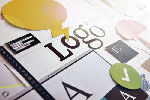
What exactly does make a good logo design? We all know a good logo design when we see it and similarly we can identify a bad logo just as quickly. A great logo is unique, appropriate, practical, simple in form and delivers your message.
Uniqueness.
Your logo should be original and stand out on its own. While it can be helpful to look at your competitor’s logos, you should never use them as a guide to create your own logo. The idea is to be different from your competitors and stand out in a crowded marketplace. You want to have a logo that is better, or at the least very different to your competitors.
Appropriate.
Your logo needs to portray the essence of your company. Understanding a particular industry’s ‘theme’ is important, and this is where a designer’s experience comes into play. How the logo is designed should be appropriate for its intended purpose. Are you a serious company such as a law firm, or one that revels in fun such as a children’s store? While a colourful cartoon logo would be appropriate for the children’s toy store, it would not be so appropriate for a law firm!
Practical.
An effective logo should be able to work across a variety of media and applications. For this reason a logo should be designed in vector format, to ensure that it can be reproduced to any size, especially on the small side. A logo should be able to work both in horizontal and vertical formats. A logo needs to be still effective even if it is printed in only one colour, printed on something as small as a ballpoint pen or something as large as a billboard, or printed in reverse.
Simple In Form.
Keep your logo metaphor simple. While it is nice for your logo to ‘mean’ something, an overworked logo is not a pretty sight and can be problematic to reproduce. It’s no coincidence that the most memorable logos are also the most simple in appearance. You want your logo to be instantly recognisable, acting as a memorable identifier for your business. Normally a consumer will just take a fleeting look at a logo, and an overly complex logo will make that opportunity redundant.
Delivers Your Message.
A logo doesn’t need to show what a business sells or offers as a service. For example, real estate logos don’t need to show houses, computer logos don’t need to show computers. A logo is purely for identification.
“Should a logo be self-explanatory? It is only by association with a product, a service, a business, or a corporation that a logo takes on any real meaning. A logo derives its meaning and usefulness from the quality of that which it symbolizes. If a company is second rate, the logo will eventually be perceived as second rate. It is foolhardy to believe that a logo will do its job immediately, before an audience has been properly conditioned.” Paul Rand*
* Paul Rand (August 15, 1914 – November 26, 1996) was a well-known American graphic designer, best known for his corporate logo designs.


